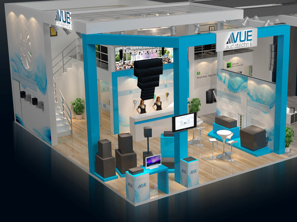
These are a selection of print advertisements I created for Adamson Systems Engineering between 2006 and early 2013 while working for them as their Marketing Manager/ Creative Director/ Graphic Designer.
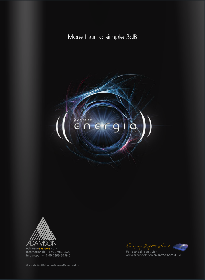


The first of the 'Project Energia' Ads. This is Adamson's first venture into powered loudspeaker systems. Hence the "electric" logo and the play on the word "energy". The headline is a reference to common audio industry lingo marking the improvement from a previous generation or other brand's loudspeakers, which is often measured only in dB (rather than other innovations and improvements) and 3 is a common number used when referring to such improvements.

This is the first "reveal" ad. The first time anyone has seen the loudspeaker. 'Project Energia' is a departure for the company, as it marked the first time Adamson used such colourful and "electric" content in their advertising and product branding.
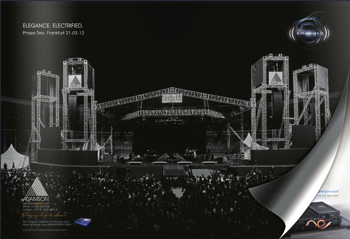
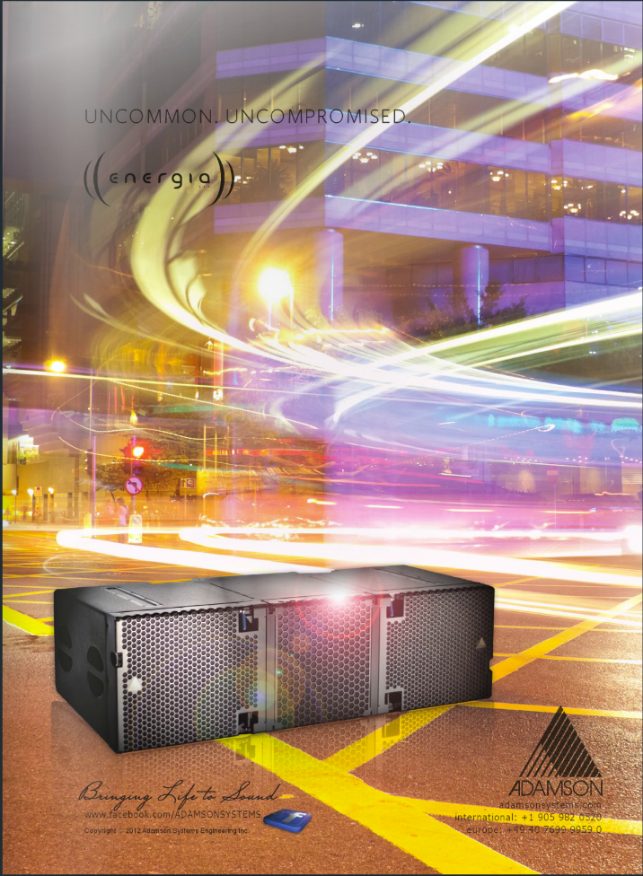
This advertisement was a sneak peek at releasing phase two of the Project 'Energia'. In the image loudspeakers in their prime focus as a statement that they have landed on the technical riders of the best and biggest tours.
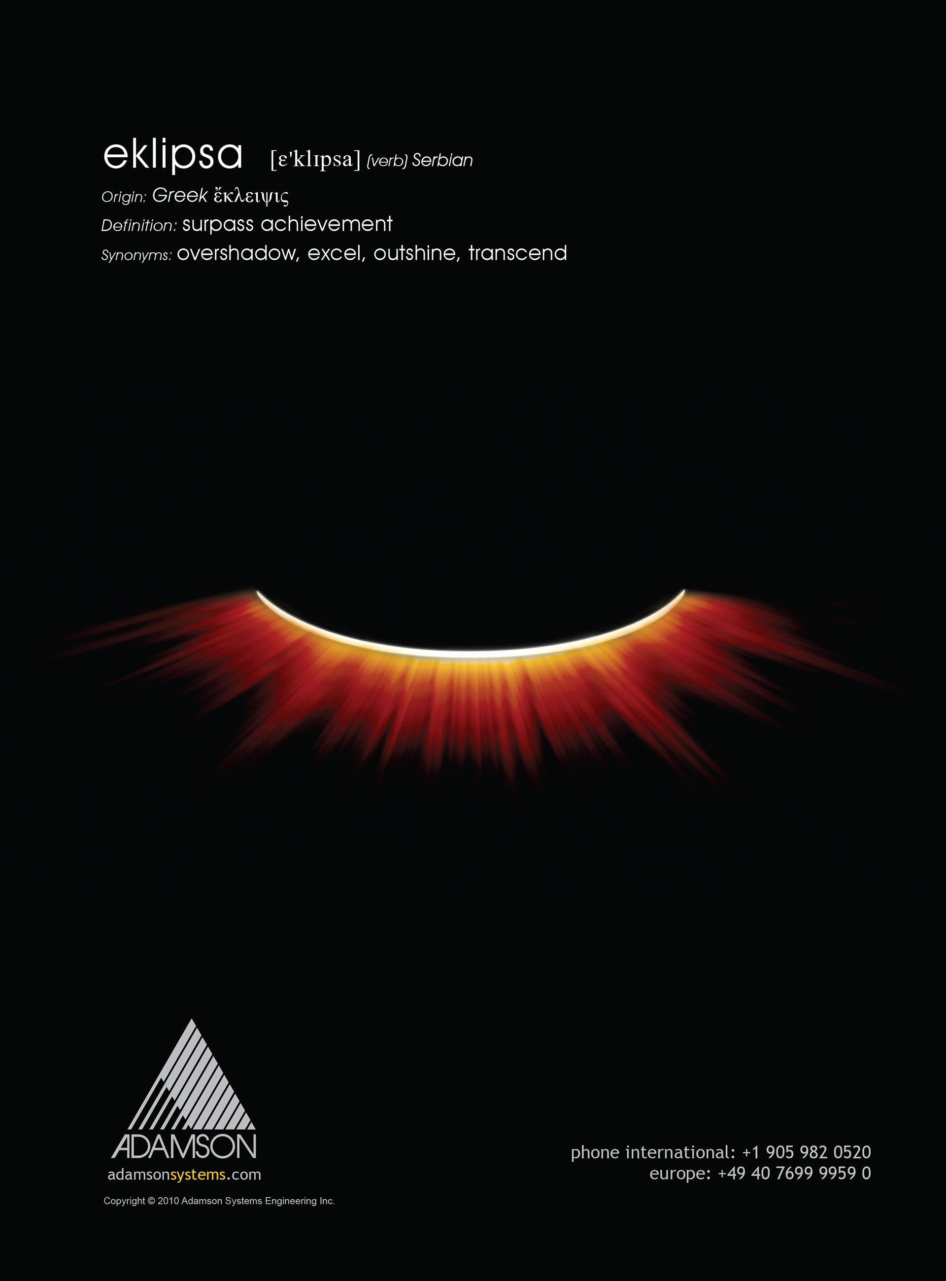
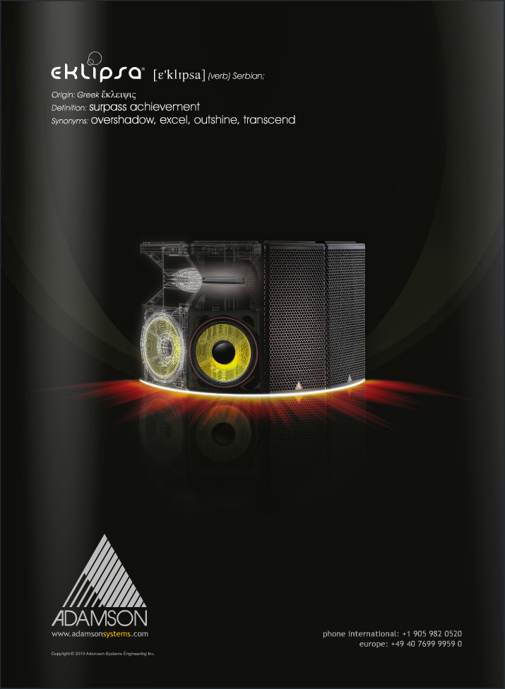
Eclipse preceded Energia but was planned as a part of the second generation of line array loudspeaker products released by Adamson Systems. This product is a line array - on its side - creating a horizontal arched line of soundwaves rather than the vertical of typical line arrays. This was the teaser ad for the product.

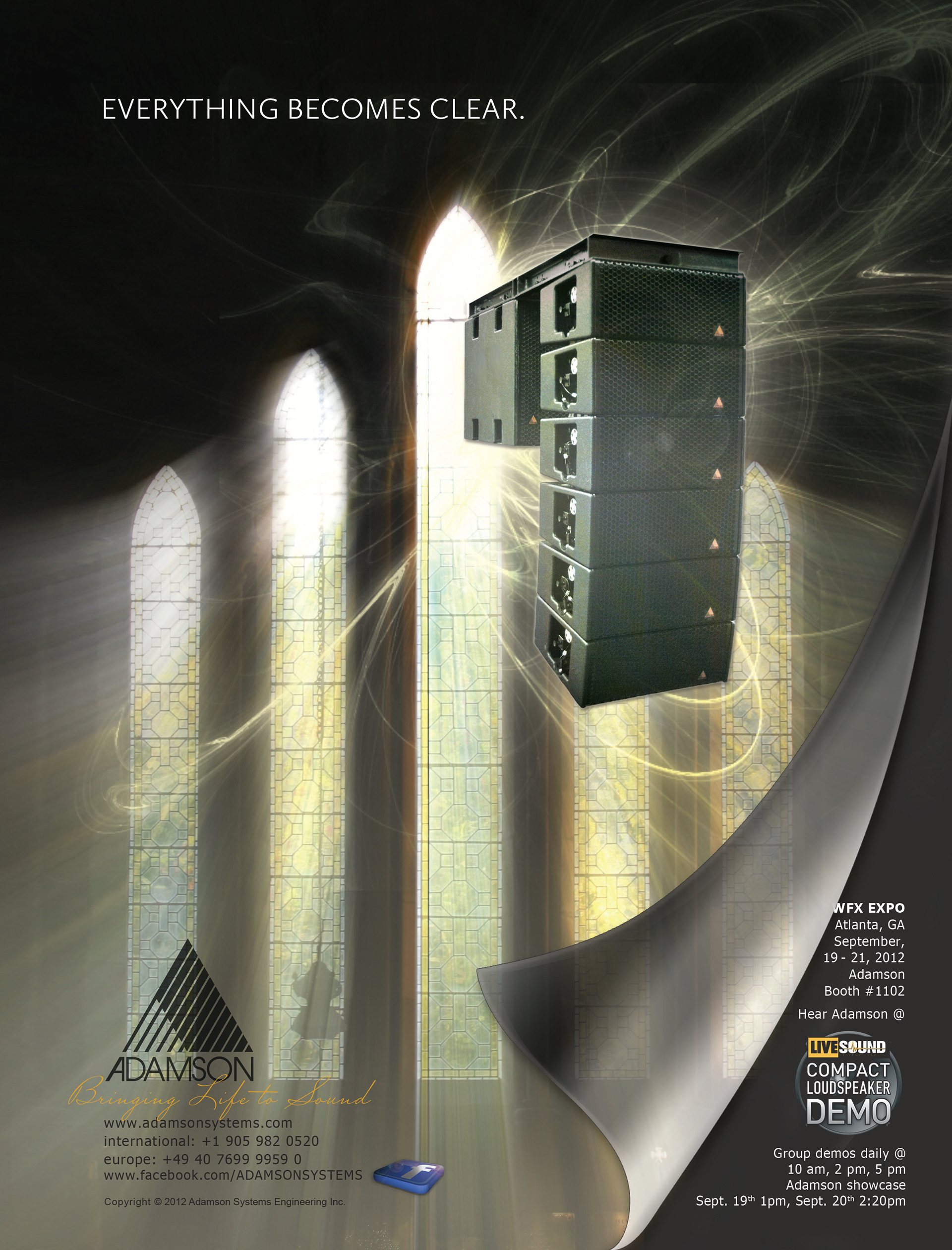
This was the reveal ad. From a technology point of view, the simple visual explains its intended use.
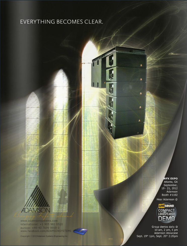
An ad created specifically for the Metrix series aimed at the Houses of Worship market segment. Intelligibility is a common issue in many Houses of Worship. This product will solve those issues. The message from the sermon is "Clear". Its simple message also signifies finding 'the answers' in worship. This version featured demo info for this specific system on the "following" page as an add-on.
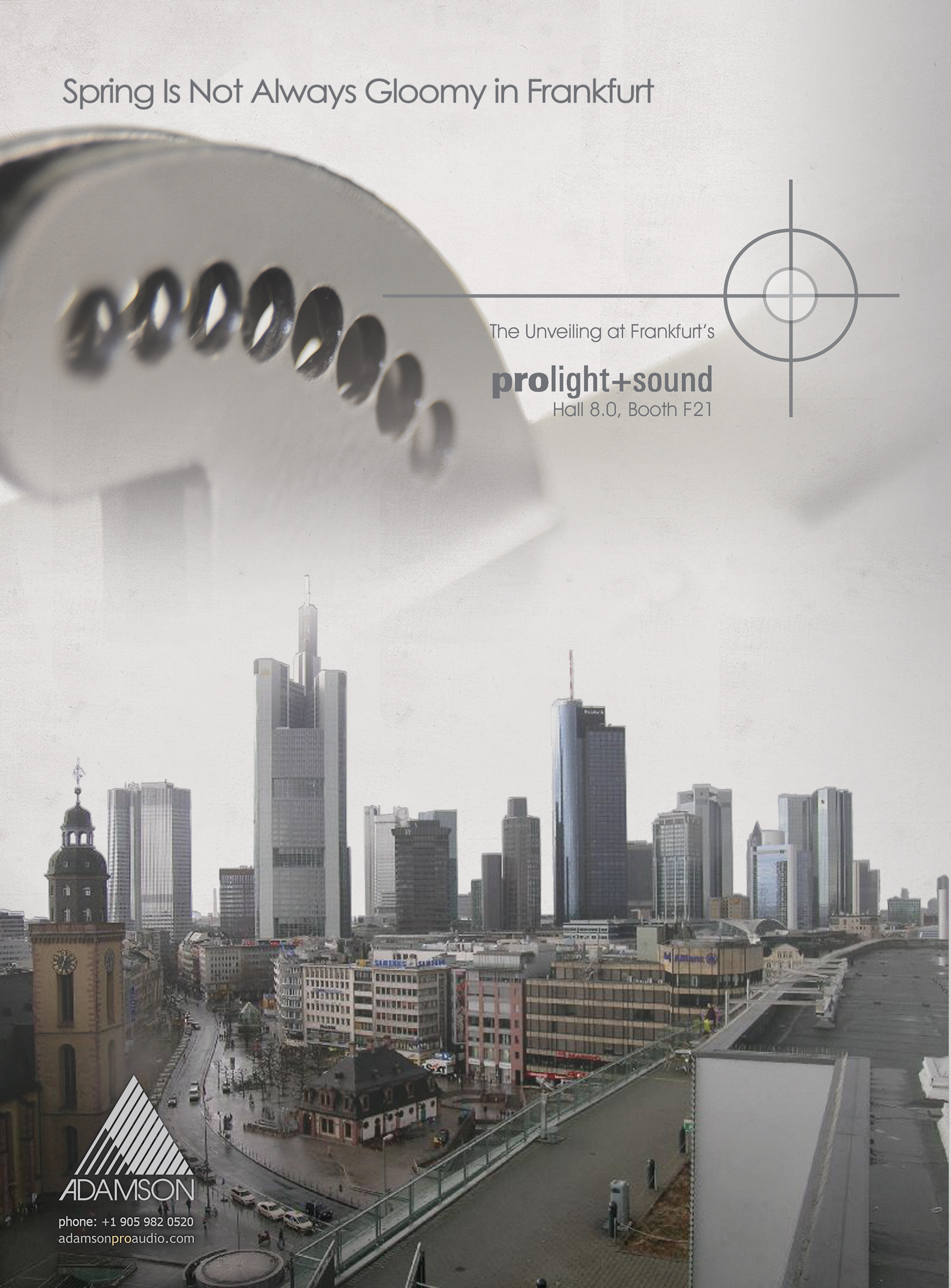
The Prolight & Sound show is the professional audio's biggest trade fair of the year. It takes place in early spring in Frankfurt, Germany, and is known as the show where many new products of the year are revealed. This was a teaser ad for an installation loudspeaker product line for Adamson Systems. The image features Frankfurt on a typical gloomy spring day, the composite is a special suspension hardware piece, and the crosshairs are part of the new product line logo (also designed by 2HB Development). The concept of this teaser ad is that there's "excitement" in the spring air - no matter what the weather is.

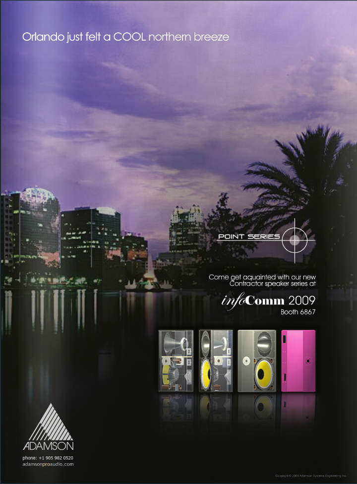
This was the follow-up ad to the "Gloomy in Frankfurt" ad. It was released in the months before the Infocomm show held in Orlando, FL., the point of release of the Point Series for the North American Market. It only shows a 3D inventor drawing of the loudspeaker line.

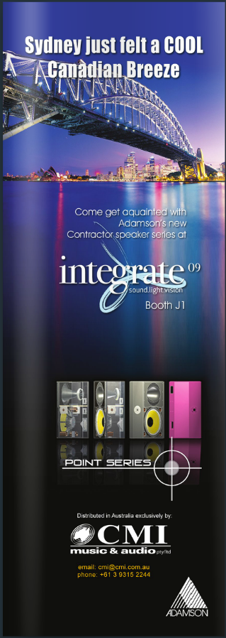
This ad was also a follow-up ad to the "Gloomy in Frankfurt" ad and was aimed at the Australian Market in advance of the Integrate show. It only shows a 3D inventor drawing of the loudspeaker line.
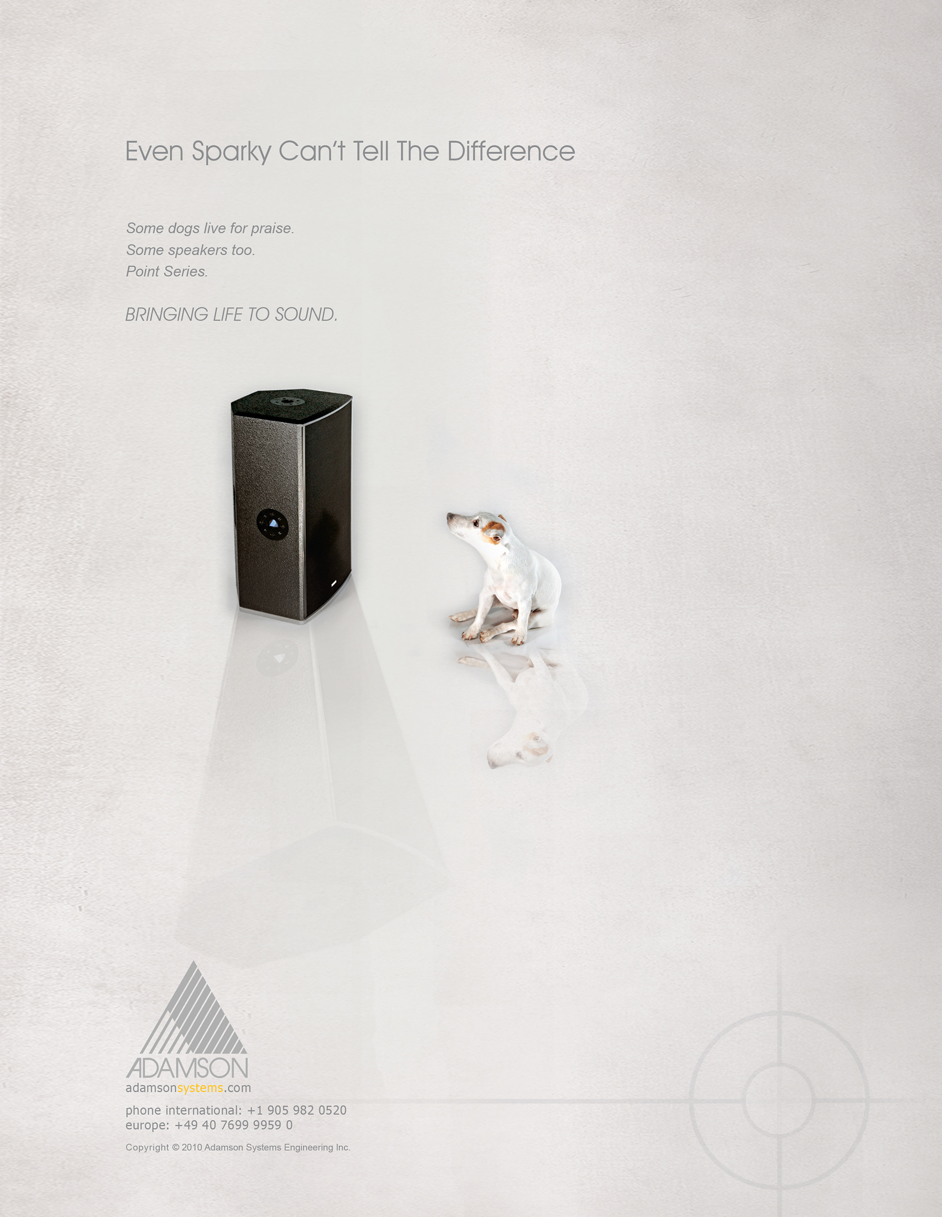
This is the first of the 'reveal' ads showing an actual image of the loudspeaker. Created using Adobe Photoshop and Indesign. During the photoshoot for the product my dog "Sparky" ran into the frame and as a joke, we shot a frame of the infamous RCA Dog from the notorious "his master's Voice" ad. (For those unaware, it features a Jack Russell Terrier with a Gramophone illustration where he can't tell his master's voice apart from the sound coming out of the gramophone). I ended up using this well-known industry reference as the launch ad for the series.
A happy accident.
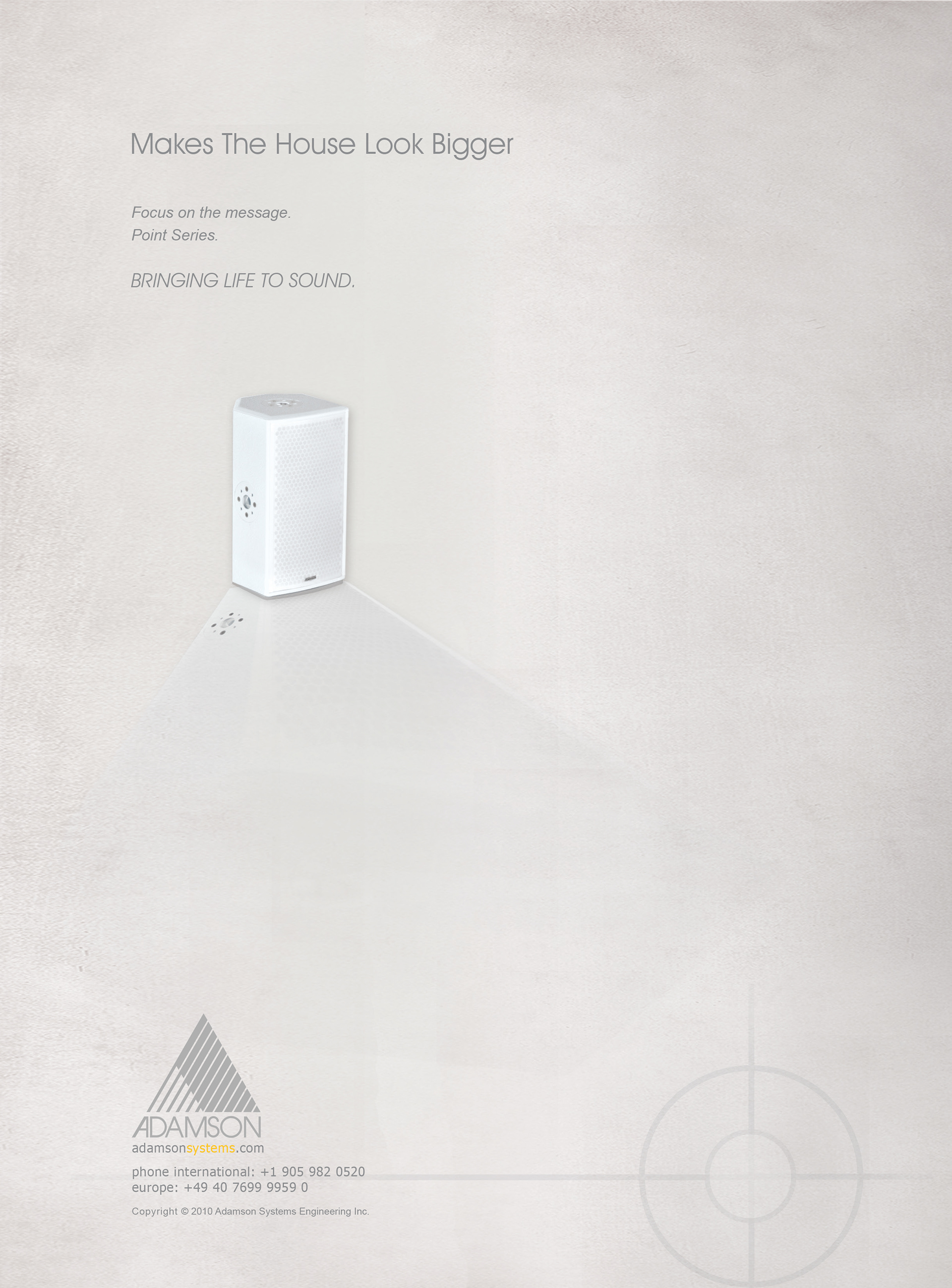
This is the second Point Series ad. The series offers compact, custom-colour loudspeakers, which make for a discreet installation in any venue and provide sound much larger than expected from a compact enclosure (Hence the oversized shadow - marking the sound "coverage" pattern of the loudspeaker box). 'House' is often the word used for a religious venue. This ad was commonly used in publications aimed at the Houses of Worship market segment. Created using Adobe Photoshop and Indesign.
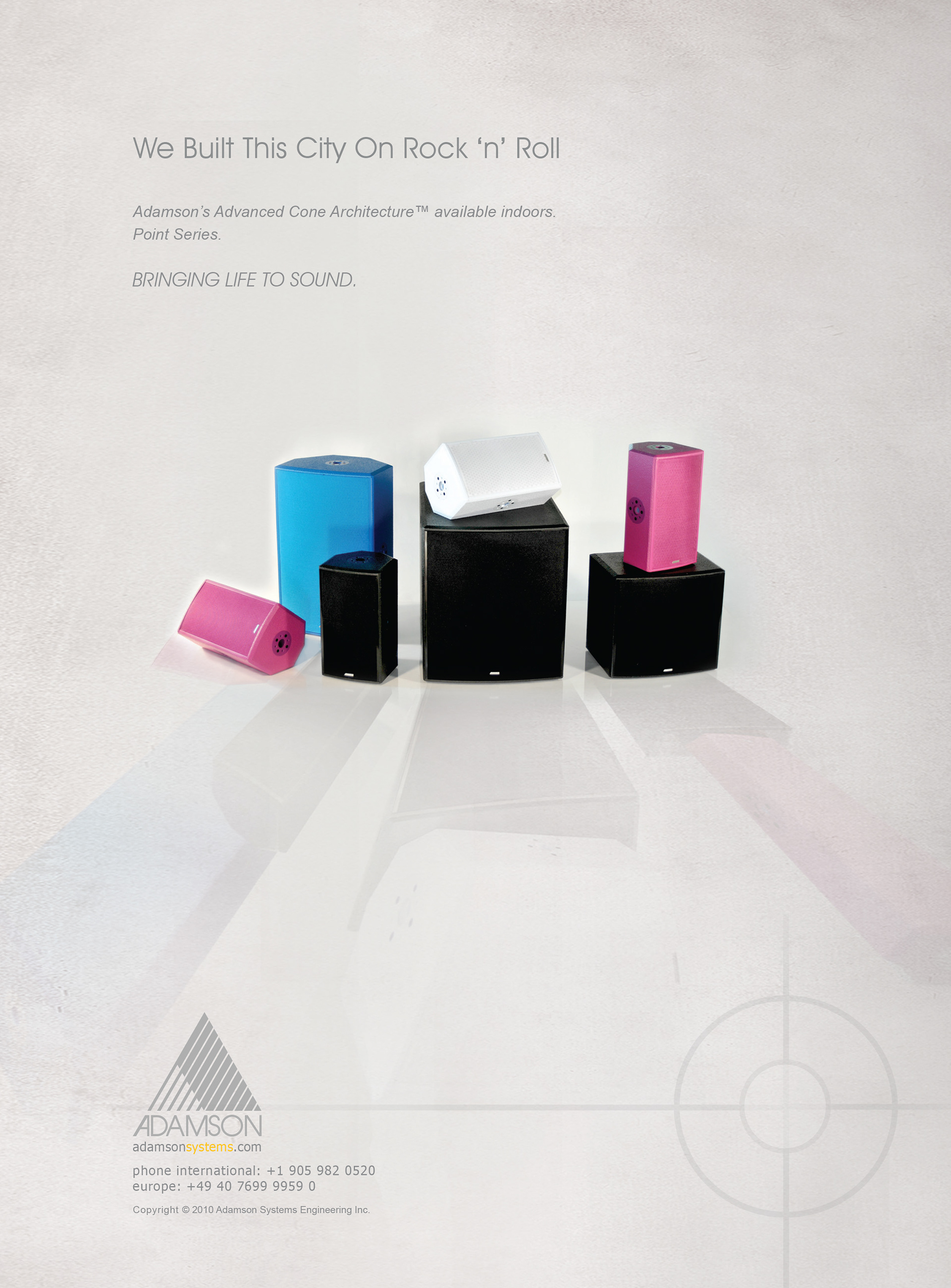
Created using Adobe Photoshop and Indesign. The product line is available in custom colours beyond, the usual "black" speaker box. The layout suggests a cityscape - with the reflection hinting at a waterfront. Adamson Systems is known as the builder of the best touring or "Rock'n'roll" loudspeaker systems in the world, and this ad messages that they are now offering some of their expensive touring technology in a full installation loudspeaker series for the very first time. This ad is intended for use in touring and installation-specific industry publications.

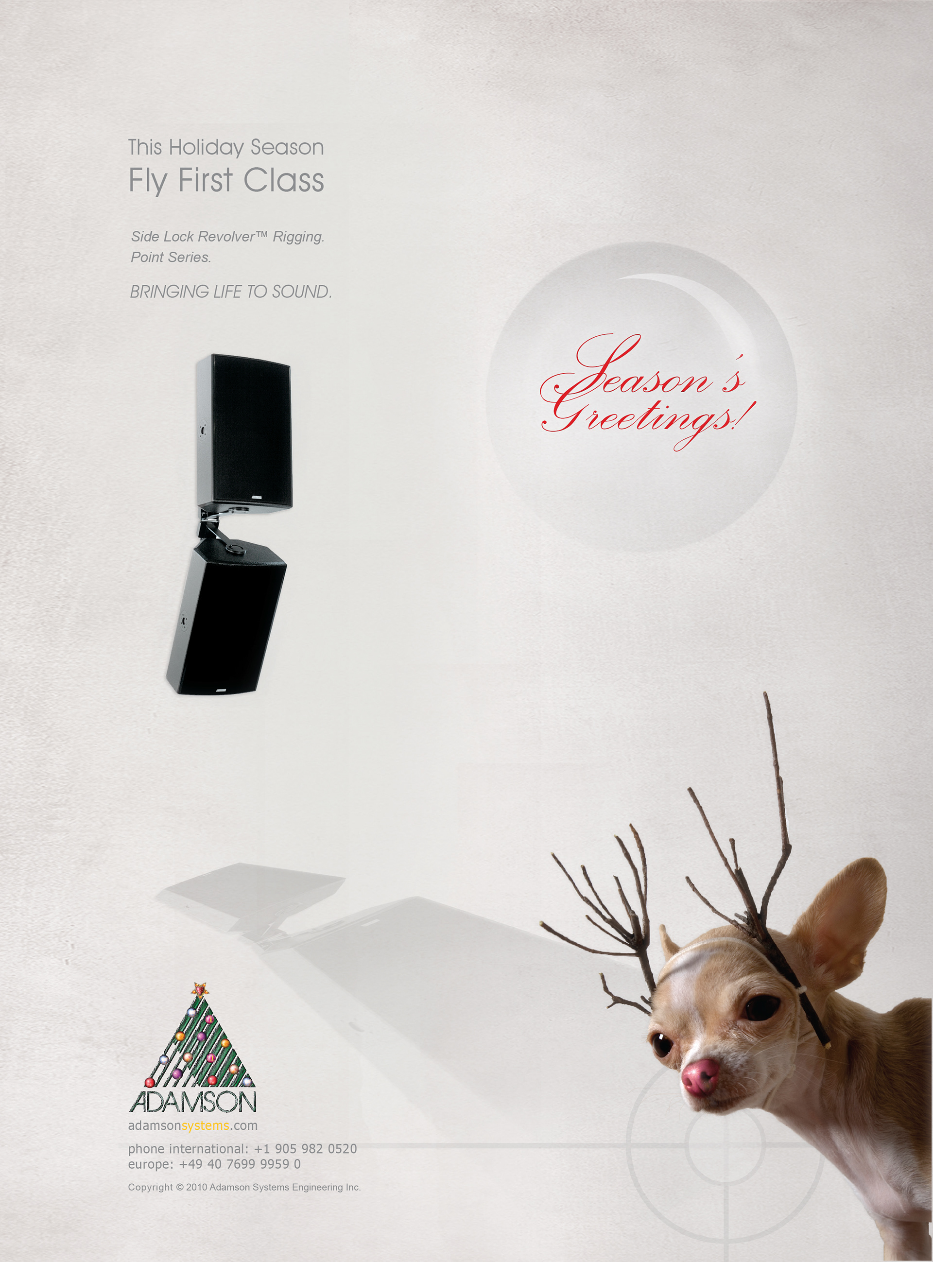
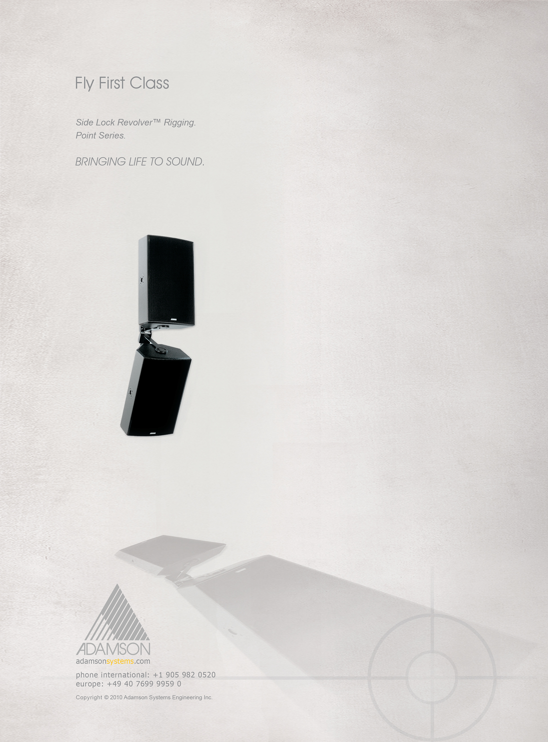
Created using Adobe Photoshop and Indesign. The fourth Point Series ad featured an arrayed and suspended system. The suspension/ rigging in the industry is referred to as "flying" a system, and there is company-specific "flying" hardware that varies in style and functionality. Adamson prides itself in these mechanisms as well. The message is we provide first-class suspension systems. This ad was directed for the mostly touring industry-aimed publications.